In this post, we’ll understand the basics of color, the concept of the color wheel, and various color schemes used by artists and designers. Let us explore the 15 distinctive combinations used to create visually appealing and meaningful works.
What is Color?
Color is a visual perception that results from the way objects interact with light. Inorder to see color, you have to have light.When light shines on an object, it can either absorb, reflect, or transmit certain wavelengths of light. The color we see is determined by the wavelengths of light that are reflected back to our eyes.The first person to discover the link between color and light was scientist Sir Isaac Newton in 1666.
He observed that when light passed through the prism, it separated into a spectrum of colors, creating a beautiful display of the rainbow. This experiment demonstrated that white light is composed of various colors, and each color has a distinct wavelength.
Newton continued his exploration by investigating color addition and subtraction. He used a second prism to recombine the colors, showing that when the colors overlapped, they could produce white light again. This discovery laid the groundwork for understanding additive color mixing, a principle crucial to technologies such as modern displays and photography.
Defining Color Theory
Color theory is a set of principles and guidelines that explores how colors interact with each other and how they can be combined to create visually appealing and harmonious compositions. Color theory encompasses a wide range of concepts, from the color wheel and harmonies to the psychological and emotional effects of colors.
Understanding the Color wheel
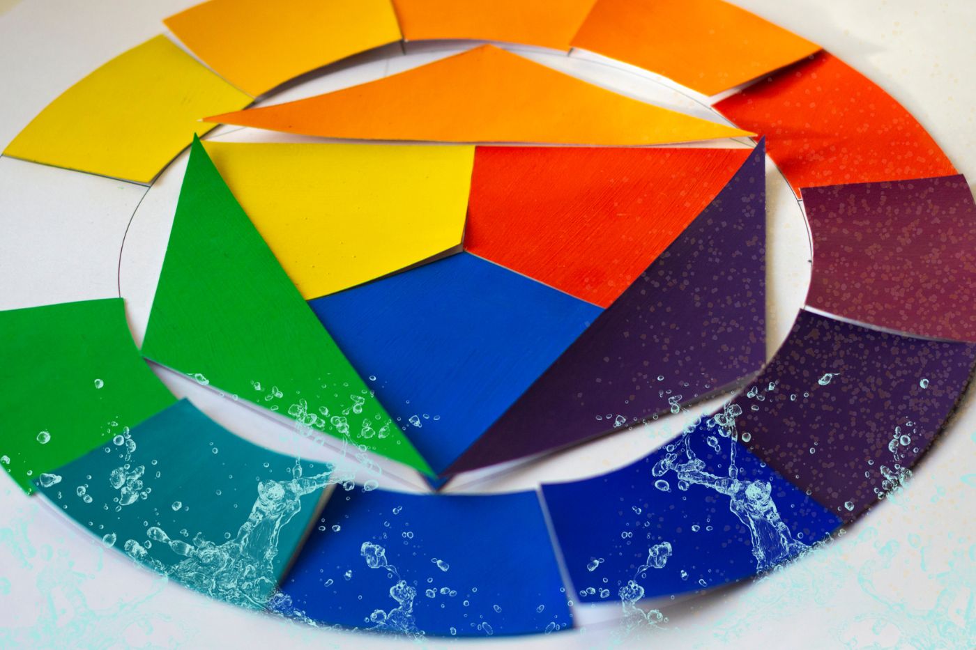
A color wheel is a circular diagram that represents the relationships between colors. It is a visual tool used in art, design, and various creative fields to illustrate how colors interact with one another and how they can be combined to create harmonious compositions. The color wheel is a fundamental concept in color theory and serves as a valuable guide for artists, designers, and anyone working with colors.
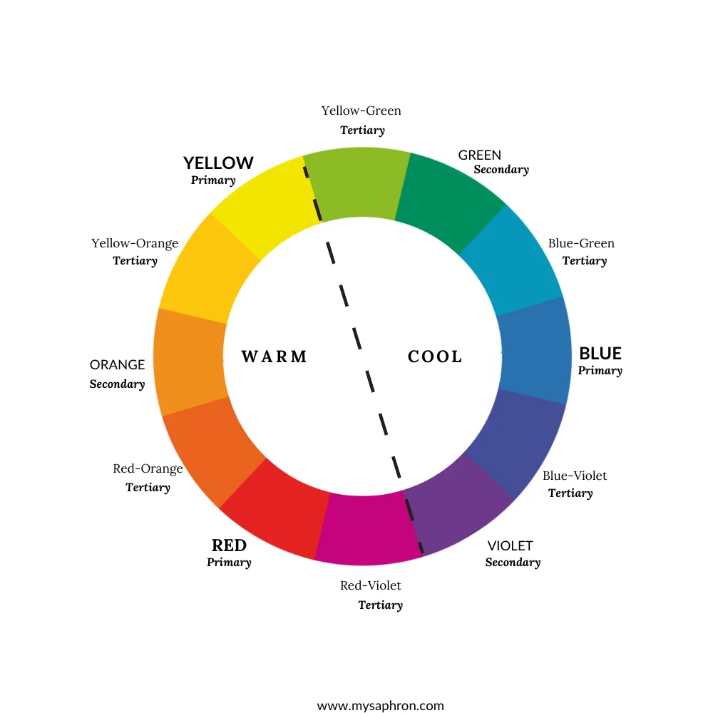
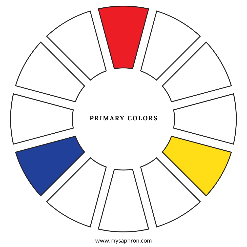
Primary Colors: Primary colors are the foundational hues that cannot be created by mixing other colors together. The three primary colors are red, blue, and yellow. These colors are called primary because they serve as the basis for creating a vast spectrum of other colors through mixing.
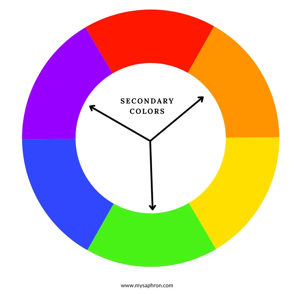
Secondary Colors: Secondary colors are the result of combining two primary colors in equal parts. The three secondary colors are green (blue + yellow), orange (red + yellow), and purple (red + blue). These hues hold a unique place on the color wheel, standing between the primary colors from which they are derived.Green, orange, and purple result from mixing two primary colors.
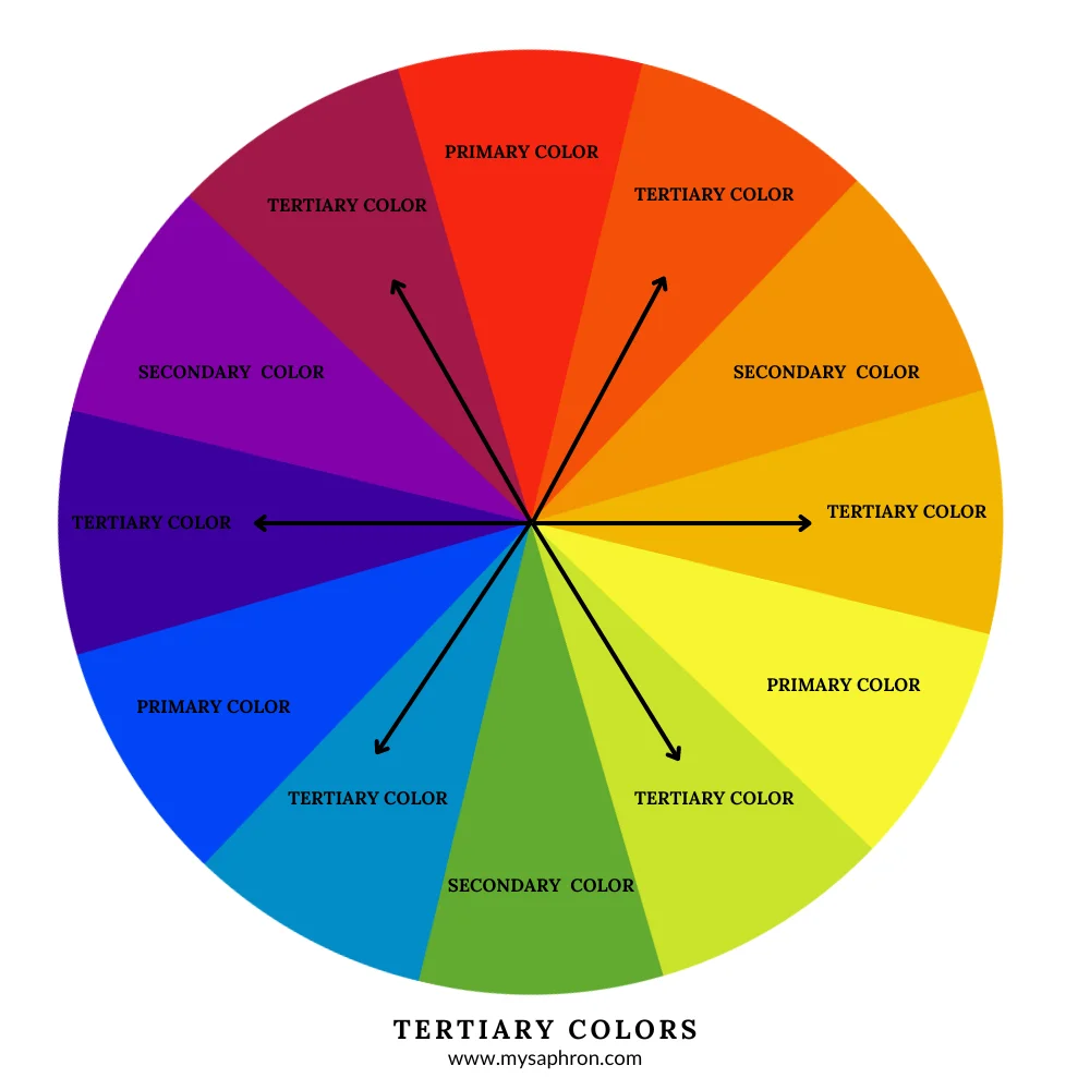
Tertiary Colors: Tertiary colors are the result of mixing a primary color with a secondary color in varying proportions. They are formed by mixing a primary color with a neighboring secondary color.
- Red-Orange
- Yellow-Orange
- Yellow-Green
- Blue-Green
- Blue-Violet
- Red-Violet
Color Properties
There are 4 main qualities of each color on our color wheel.
a. Hue: Hue is the pure essence of a color, which defines its unique place on the color wheel. In simpler terms, hue is the characteristic that allows us to identify and label colors – it is the brightest and purest form we see the color without any tint or shade. It’s what allows us to identify red, blue, or green. In a color wheel you will find 12 basic hues- 3 primary colors + 3 secondary colors +6 tertiary colors.
The following are the 12 basic hues found on a color wheel.
- Red
- Red-Orange
- Orange
- Yellow-Orange
- Yellow
- Yellow-Green
- Green
- Blue-Green
- Blue
- Blue-Violet
- Violet
- Red-Violet
b. Saturation: Saturation is the intensity or chroma of a color. Highly saturated colors are vibrant, while desaturation results in muted tones that is dull.
c. Brightness/Value:The degree of lightness or darkness in a color. It is often represented in a grayscale, with white being the highest value and black the lowest. We can create shades of a color by adding black and tints of that color by adding white and tones by adding grey.
d. Temperature: The color wheel is split into 2 main groups. Warm colors and Cool colors.F Warm colors include reds, oranges, and yellows and are found on the color wheel’s red to yellow spectrum. Cool colors encompass blues, greens, and purples and they are situated on the blue to green side of the color wheel.
Color Harmonies
Color harmonies are the arrangements of colors that work together in a visually pleasing and balanced manner. These combinations follow specific principles derived from the color wheel, resulting harmonious and aesthetically pleasing color combinations. The goal is to create a sense of unity, balance, and visual interest in the overall design or artwork.
Here are few of the color harmonies that you may want to consider in your creating a color palette for your signature style.
Complementary Color Scheme
Complementary colors are positioned directly opposite each other on the color wheel. When combined, they create a high contrast and vibrant effect.
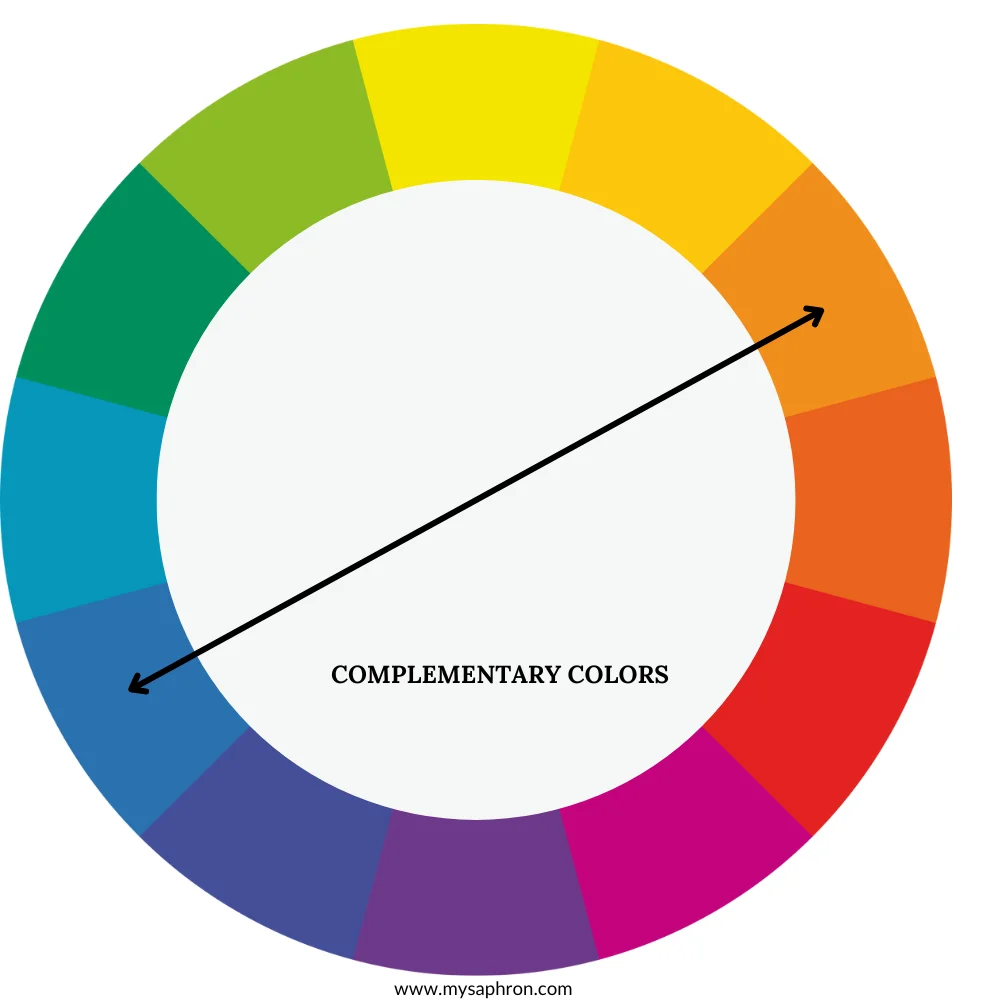
Examples of complementary colors scheme:
- Red and green.
- Blue and orange.
- Yellow and purple.

Split-Complementary Color Scheme
A split-complementary color scheme involves a base color and the two colors adjacent to its complementary color. For instance, if the base color is red, the scheme might include yellow-green and blue-green.
The split-complementary color scheme is an extension of the complementary scheme. Instead of using colors directly opposite each other on the color wheel, it involves a base color and the two colors adjacent to its complementary color. This creates a color harmony that retains contrast while offering a more nuanced and balanced look.
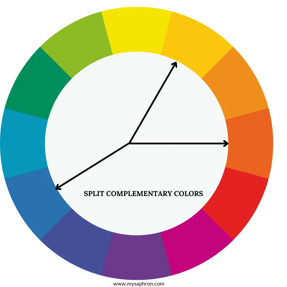
Examples of Split-Complementary Color Scheme:
Base Color: Red-Orange
- Split-Complementary Colors: Blue and Green – This scheme involves red-orange as the base color, with blue and green as the split-complementary hues. The warm base color is complemented by the cool tones of blue and green.
Base Color: Yellow-Green
- Split-Complementary Colors: Red and Violet- In this example, yellow-green serves as the base color, with red and violet as the split-complementary hues. The cool base color is complemented by the warm tones of red and violet.
Base Color: Blue
- Split-Complementary Colors: Red- Orange and Yellow-Orange – Using blue as the base color, the split-complementary scheme includes red-orange and yellow-orange. The cool base color is balanced by the warmth of red-orange and yellow-orange.

Analogous Color Scheme
Analogous colors are groups of colors that are adjacent to each other on the color wheel. These colors share similar undertones and often create serene and harmonious color schemes. They involve colors that smoothly transition from one to another on the color wheel. This creates a sense of continuity and avoids sharp contrasts.
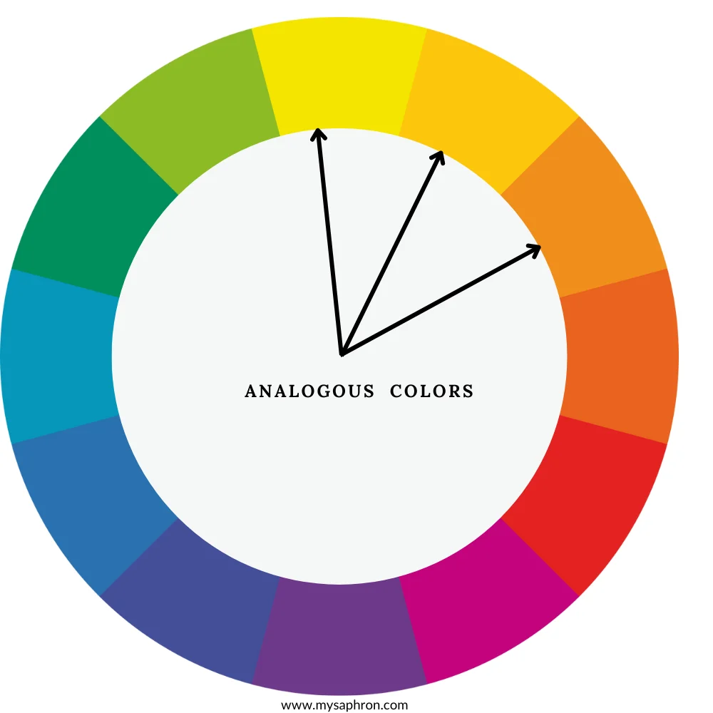
Examples of Analogous Color Scheme:
- Blue-Green, Blue, Blue-Violet: This analogous color scheme includes colors from the blue and violet sections of the color wheel. For example, turquoise, cerulean blue, and periwinkle.
- Red, Red-Orange, Orange:In this scheme, colors range from red to orange. For example,Vermilion, scarlet, and tangerine
- Yellow-Green, Yellow, Yellow-Orange: In this range you may have lemon yellow, dandelion, and amber as your analogous color palette.
Triadic Color Scheme
Triadic colors are a set of three colors evenly spaced around the color wheel. This color scheme creates a sense of balance and vibrancy, as it includes hues that are equidistant from each other. Triadic color combinations often result in visually appealing and dynamic compositions.Even though they are less contrasting than complementary colors, triadic schemes still offer a degree of bold and vibrant contrast that can make each color stand out.
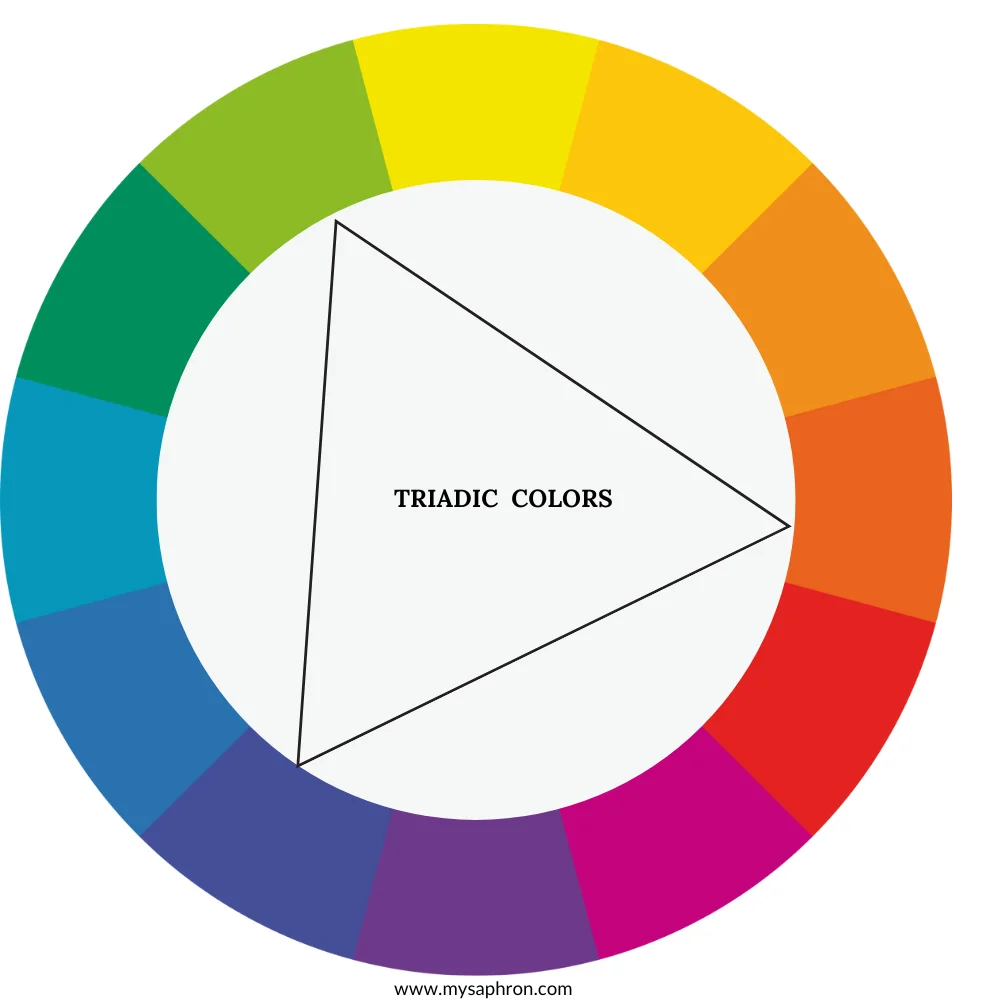
Examples of Triadic Color Scheme:
- Red, Yellow, Blue
- Orange, Green, Violet
- Yellow-Orange, Blue-Green, Red-Violet

Tetradic Color Scheme
The tetradic color scheme, also known as double-complementary or rectangular scheme, involves the use of four colors together in the form of two complementary color pairs. Tetradic colors provide a broad range of hues, offering a diverse and visually interesting color palette.In this case one color can be used as the base color with the other 3 colors used as accents.
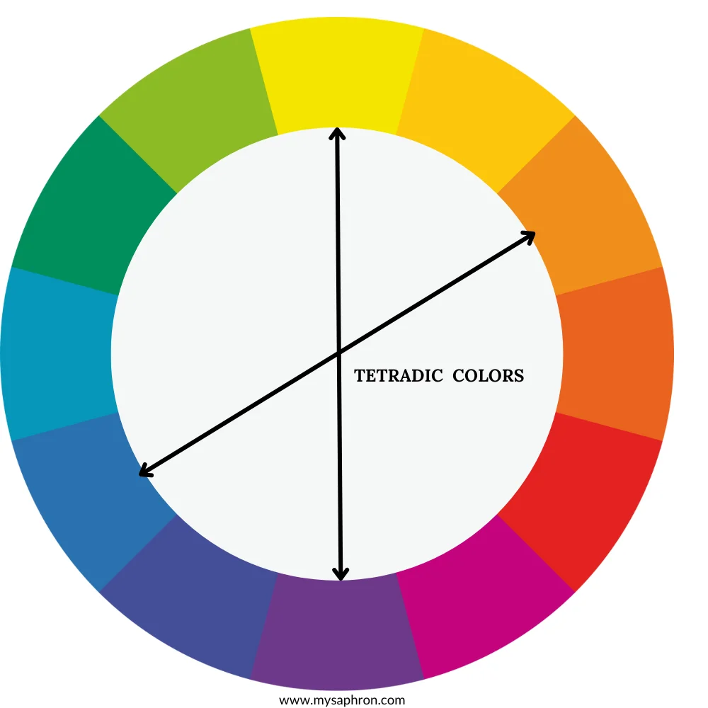
Examples of Tetradic Color Scheme:
- Complementary Pairs: Blue-Orange and Yellow-Violet
- Complementary Pairs: Red-Green and Blue-Orange
- Complementary Pairs: Yellow-Green and Red-Purple

Monochromatic Color Scheme
Monochromatic color is taking one base color and then use shades, tints or tones to create the variations of the base color.

Examples of Monochromatic Color Schemes:
- Whites and Off-Whites: A monochromatic scheme using various shades of white and off-white can create a clean and minimalist aesthetic.
- Blues and Navy: Shades of blue, ranging from light sky blue to deep navy, can add a sense of calm and depth in both design and fashion.
- Greyscale: Using different tones of grey, from light silver to dark charcoal, can produce a sophisticated and timeless look.

Monochromatic with Accents Color Scheme
The monochromatic with accents color scheme is an extension of the monochromatic scheme. It primarily relies on variations in a single base color, accompanied by small accents of other colors for contrast and visual interest. This scheme provides a harmonious and elegant look adding subtle pops of color to prevent monotony.
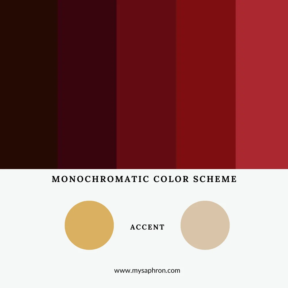
Examples of Monochromatic with Accents Color Scheme:
Base Color: Blue
- Accents: Soft White, Pale Gray – In this example, shades of blue, ranging from navy to powder blue, form the monochromatic base. Soft white and pale gray are used as accents to provide subtle contrasts and highlights.
Base Color: Burgundy
- Accents: Gold, Cream – A monochromatic scheme centered around burgundy is accented with gold and cream. The accents introduce warmth and sophistication to the rich burgundy palette.

Achromatic Color Scheme
The achromatic color scheme is a minimalist and classic approach that relies solely on the use of black, white, and various shades of gray. Unlike schemes based on vivid colors, achromatic compositions offer a timeless and sophisticated aesthetic, emphasizing the interplay of light and shadow.
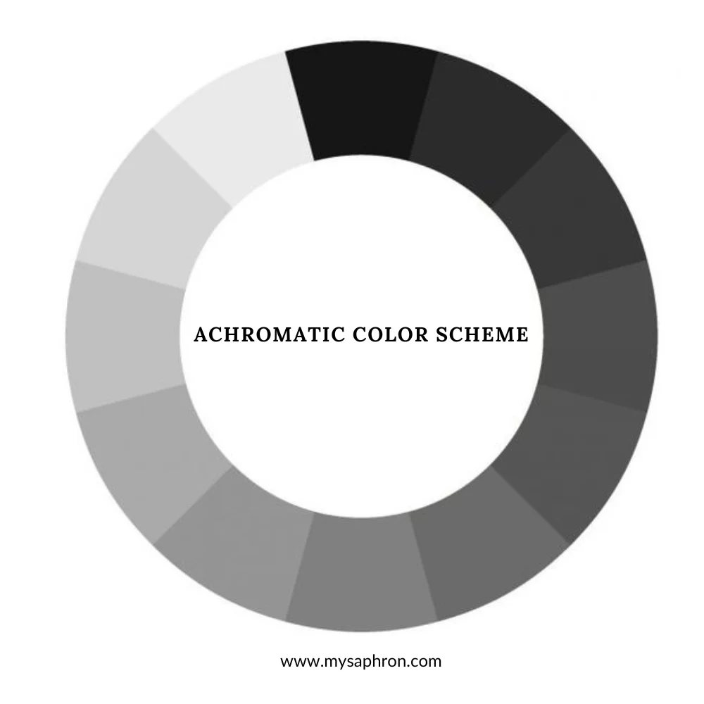
Examples of Achromatic Color Scheme:
- Black and White
- Gray Scale
- Ivory and Cream
- Silver and Charcoal
- White and Beige
- Graphite and Off-White

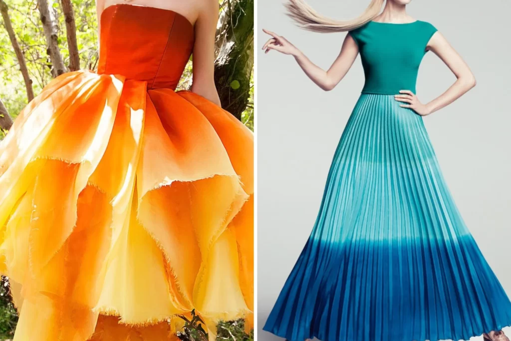
Warm and Cool Color Schemes
Warm and cool color schemes are based on the emotional associations and visual effects of colors. Warm colors, including reds, oranges, and yellows, evoke feelings of warmth, energy, and vibrancy.
In contrast, cool colors, such as blues, greens, and purples, convey a sense of calmness, tranquility, and serenity. Utilizing either warm or cool color schemes allows artists and designers to evoke specific emotions and set the tone for their compositions.


Pastel Color Scheme
The pastel color scheme is characterized by the use of soft, muted, and light shades of traditional vibrant colors. These delicate hues are often associated with a gentle and soothing aesthetic, creating a sense of calmness and subtlety. Pastel colors are typically achieved by adding white to pure hues, resulting in a beautiful subtle palette.
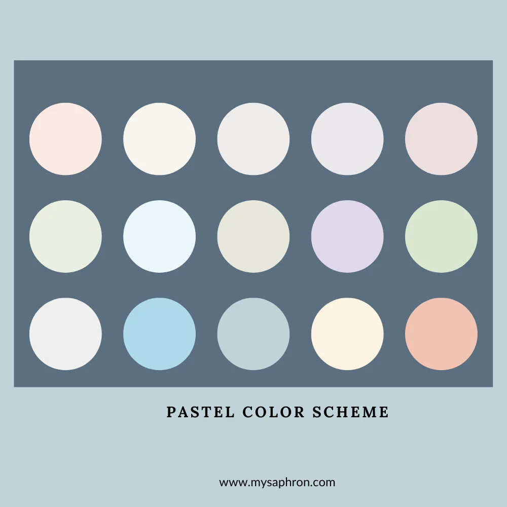
Examples of Pastel Color Scheme:
- Soft Pink and Mint Green
- Lavender and Powder Blue
- Pale Yellow and Peach
- Muted Coral and Light Gray
- Baby Blue and Soft Lemon

Earthy Color Scheme
The earthy tones color scheme draws inspiration from the natural hues found in the environment, reflecting the rich, warm, and grounded colors present in landscapes, soil, and vegetation. This color scheme comprises shades of mostly browns, greens, and warm neutrals.
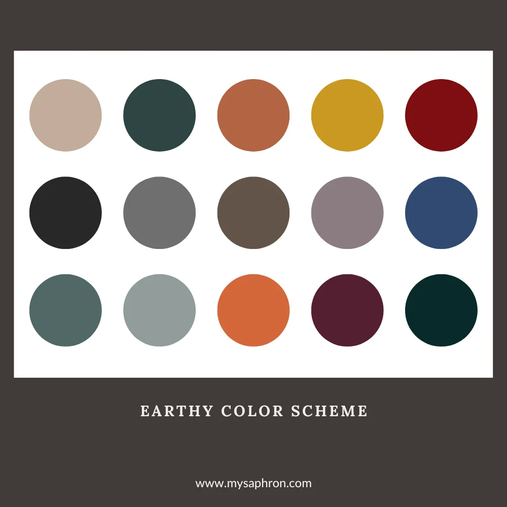
Examples of Earthy Tones Color Scheme:
- Olive Green and Warm Brown
- Terracotta and Desert Sand
- Burnt Sienna and Muted Gold
- Earthy Taupe and Sage Green
- Mossy Green and Clay Brown

Neutral Color Scheme
The neutral color scheme is characterized by the use of colors not found on the traditional color wheel, such as whites, grays, blacks, and various shades of brown. These subtle tones create a sophisticated and timeless aesthetic in your choice of creating your own color palette .
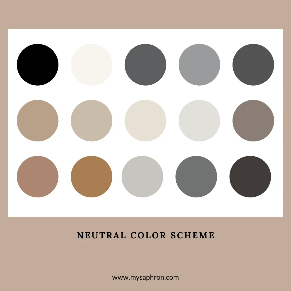
Examples of Neutral Color Scheme:
- Timeless Black and White
- Subtle Shades of Gray
- Creamy Beige and Ivory
- Natural Hues of Taupe and Brown
- Soft Grey and Charcoal Accents